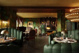
Following the launch of Epicurean – an F&B design studio from the team behind Goddard Littlefair – founders Martin Goddard and Jo Littlefair sit down with Supper to talk new approaches and the upcoming Villa Copenhagen.
What kind of F&B experiences have influenced you both over the years?
JL: Le Manoir aux Quat’ Saisons was incredible, because it was the first time I’d experienced service on that level. Getting that detail right sets a higher level of expectation, and seeing how service came together with the flavours and experimentation was inspiring. Since then I’ve had a lot of respect for what chefs can create as an art form – it’s an experience in itself. We talk a lot about experiential travel, but the fact a meal is an experience that can change your perception of a culture is a big influence.
MG: We were flown to Stockholm to eat at Niklas Ekstedt’s restaurant – a very cool, almost basement-like space. The whole place was done completely in-line with his ethos, and the way he cooks. He uses a lot of birch wood, and the scent flows throughout the restaurant and really draws you in. It’s not a display kitchen as much as its a kitchen in the restaurant, so it was fascinating to see how different ingredients were cooked on various parts of the oven or grill. They would throw a few coals onto the hob and hang a pan over the top which would be your mussels steaming, or Ekstedt would take some dried pine needles and throw them on and spark up bit of flame. It was an amazing set up – we had the chef’s table, and the explanations behind each ingredient really blew me away. To me, these are the kinds of experiential ideas that we try to use in our work.
JL: The interior of that particular restaurant really reflected the rustic nature of his cooking, but there was a sophistication to the details. It wasn’t overly complicated, but the design drew everything from the food and the philosophy through to the interior. We think a lot about that extra layer, and hopefully people will be able to see that when Villa Copenhagen launches.
What can guests expect from the F&B spaces at Villa Copenhagen?
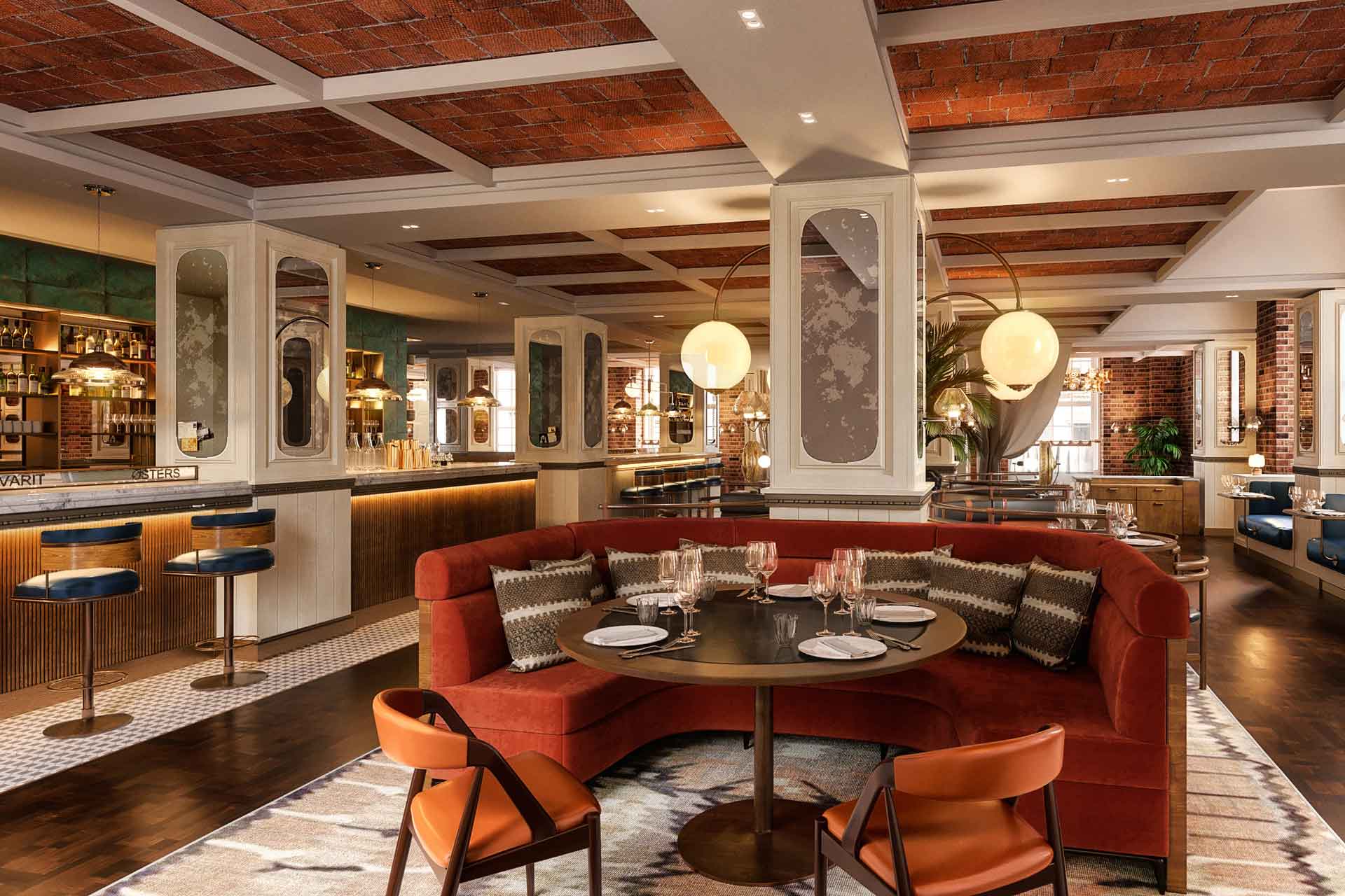
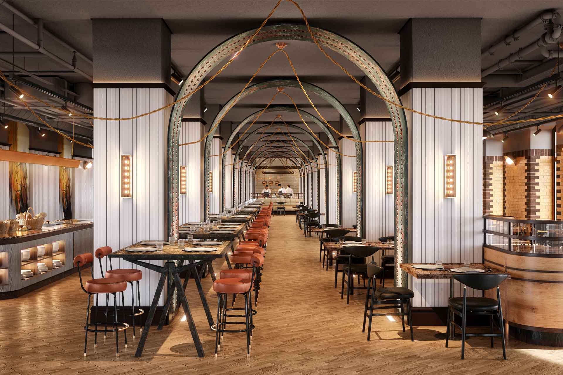
JL: The building itself is this beautiful megalithic structure right next to the train station, so as you arrive in the city you can literally turn right and see it. We wanted to create an immediate draw, beginning from the brasserie, which is right on the axis.
MG: The project resonates with something like The Ned, in that there’s a lot going on under one roof, but the brief for the public spaces was to have them be more about the people living in Copenhagen. There was a real driver for it to be inclusive, not exclusive, and it was interesting to us, because visiting Copenhagen we started to understand the character more. It’s similar to Berlin in a way – edgy and cool, but they still enjoy quality experiences, and they don’t want to be seen showing off. So the spaces are downplayed, but there’s a high level of layering and detail. The public spaces aren’t overtly luxurious – even though it is fine dining in some areas – because you won’t see suits, you’ll see jeans and a jacket. It’s a luxury hotel but it has that edge.
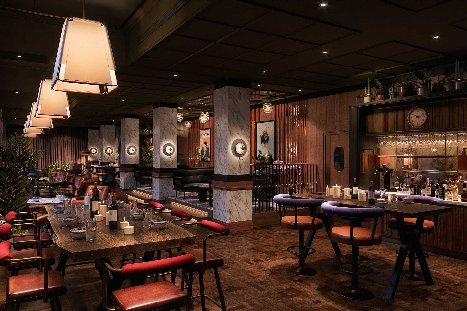
JL: There’s also a multifunctional Playroom – it has a stage that could be a bar, a food service station or a band performance space, but it links to the bigger bar next door; you could be in there on a busy Friday night and it will spill over into this area. The brasserie is more formal, but still quite relaxed, and then the all-day dining and breakfast restaurant is 250 covers but also doubles as the pre-function for the ballroom, which links to an outside terrace that is part of the streetscape along the side of the station. All of these feed into the courtyard, which is the heart of the hotel.
MG: We’ve also created a coffee shop and bakery that has frontage out on to that streetscape, so even though they’re baking bread for the breakfast service, they’ll also be selling it out of the window. All of those spaces are really key to the offer, so they’ve been a really interesting challenge. Our angle was to try and tie it together, wherever possible, back to the building, and the architectural heritage of the structure.
When going into these big projects with multiple F&B concepts competing for attention, what are the kind of things that have to be balanced?
JL: A lot of the time we’re thinking about projects as a sequence of experiences through the day, and how we move and transform between these phases. At Villa Copenhagen, we wanted to create definitive restaurants and bars on a basis that within the hotel you can have all those selective experiences, but also to allow them all to work day and night. The brasserie is somewhere that works great as a morning space, for meetings, and for dinner – it can dim down and be all twinkling lights at night, but then it can also be bright and breezy in the morning. Considering that these are spaces where people will sometimes be moving quickly through, and that the hotel can accommodate a lot of guests, one of the main things we had to be conscious about what kind of FFE went into them. It had to be light, easy to move around and durable too, because there needed to be a lot of function in them.
Did you have to change your approach to design when launching an F&B-focused studio?
JL: The launch of Epicurean came off the back of realising over a period of two or three years that you need to totally change your approach. We decided with Epicurean that we would make a statement that there is a completely different mindset required for F&B design. It’s a completely different field – it works at a different pace to the rest of the hotel, and has to adapt and react to trends more quickly. F&B design has a whole different set of constraints and requirements, and we’ve recruited specialist designers to work with us on this. I’ve always been involved in designing restaurants and have understood the market, but by getting a few specialists in with more experience doing standalone restaurants, you really start to think about the different approaches that could be brought in to hotel restaurants.
MG: One of the reasons for the new brand was that we really wanted to do something different. There are designers that work in a specific, certain style, and that’s very much their work, and then there’s designers that do very commercial projects that are more about the brand – I think we sit somewhere between those, where there’s no particular style, and its all about the place and food we’re trying to showcase. F&B spaces are not just in restaurants anymore; they are in the lobby, they are in the spa, they are on the street, and they are popping up. It’s not so much about designing the dining room any more, which is what it always has been, it’s much more about taking these concepts into every space, and allowing people to eat and drink where they want. We’d like to change the perception of what this could be – instead of a little fridge in the corner with a couple of miniatures, could you have the ingredients used in the restaurant showcased in the room? Could the suppliers of the fruit from the market down the road be brought into this? Could you fill out a questionnaire when booking with your favourite cocktail and then have it there waiting in your room when you arrive? It’s things like this that will make the whole experience feel more immersive and high-end.
JL: That is one of the key things that people travel for – life-changing and immersive experiences – and this is anything from a bar of chocolate produced around the corner on your pillow to being treated as a person and an individual rather than just another guest. Some operators haven’t made that leap yet.
Do you think this perception will become the norm over time? Is this shift towards a more experiential approach still in progress?
MG: There is still a bit of a kickback and resistance, which is fair because sometimes people don’t want a show kitchen or display service – they just want to sit down and eat great food. Sometimes the calibre of staff isn’t there, or sometimes just not the appetite. Then again, sometimes it’s a design choice – working with Jason Atherton was very interesting in this respect. On that project he started off with a display kitchen, but then decided to close it up and keep noise out of the restaurant so diners could just enjoy the food and service. And often it can be a case of the cooking experience not working in a space – those with a theme especially – because they’re often theatrical enough that you don’t need that extra drama of a kitchen.
JL: After coronavirus there are going to be more people than ever seeking honesty in their interiors, and they’ll search out spaces that have this openness to be themselves, whatever that might be. Our job as designers is to work out what a client or chef is trying to achieve, and work out what will be the best fit for them and the marketplace. In the case of Villa Copenhagen it’s a destination, and we’re hoping an experience people will travel for.
Does Epicurean have any other projects on the boards?
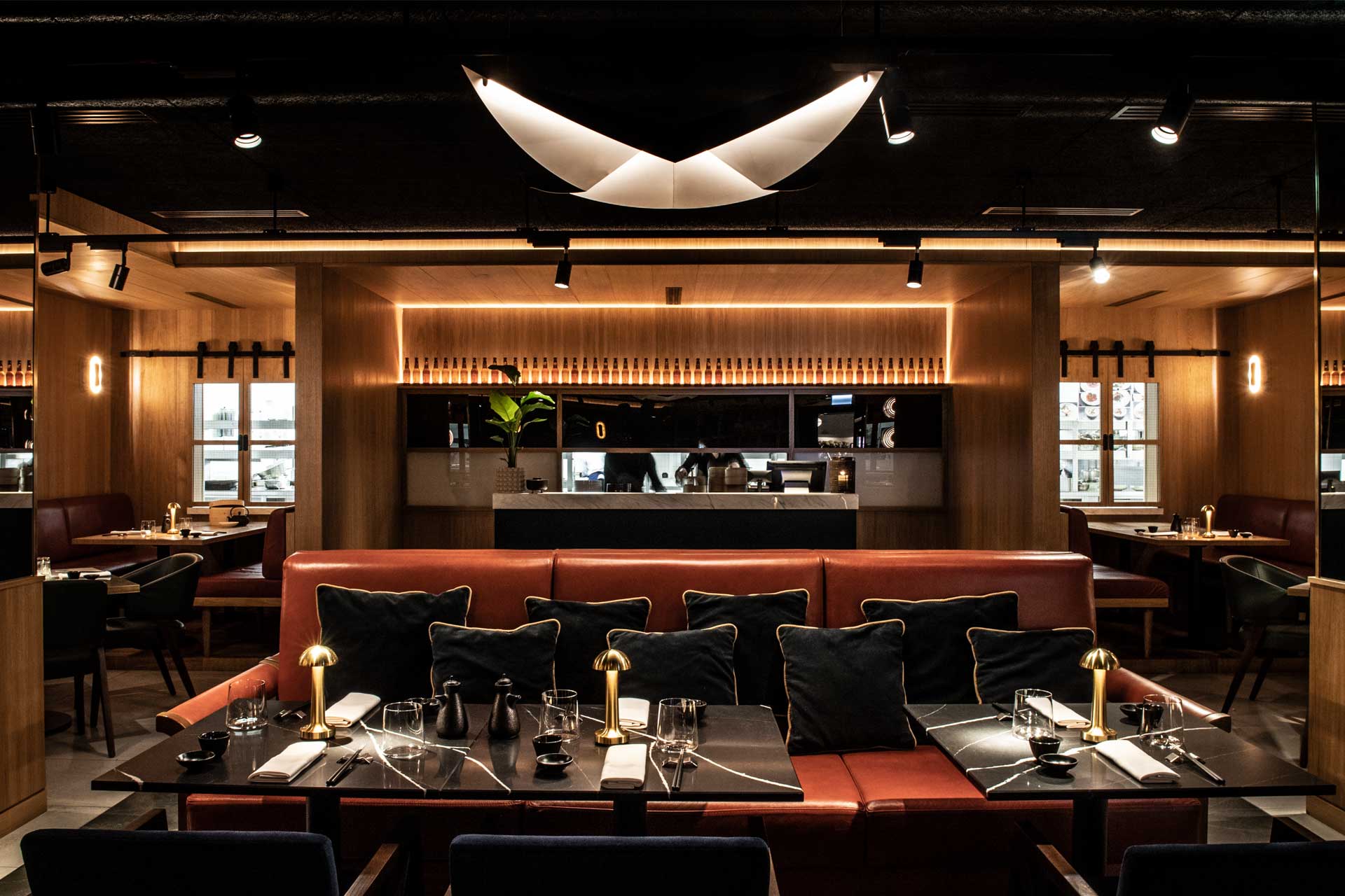
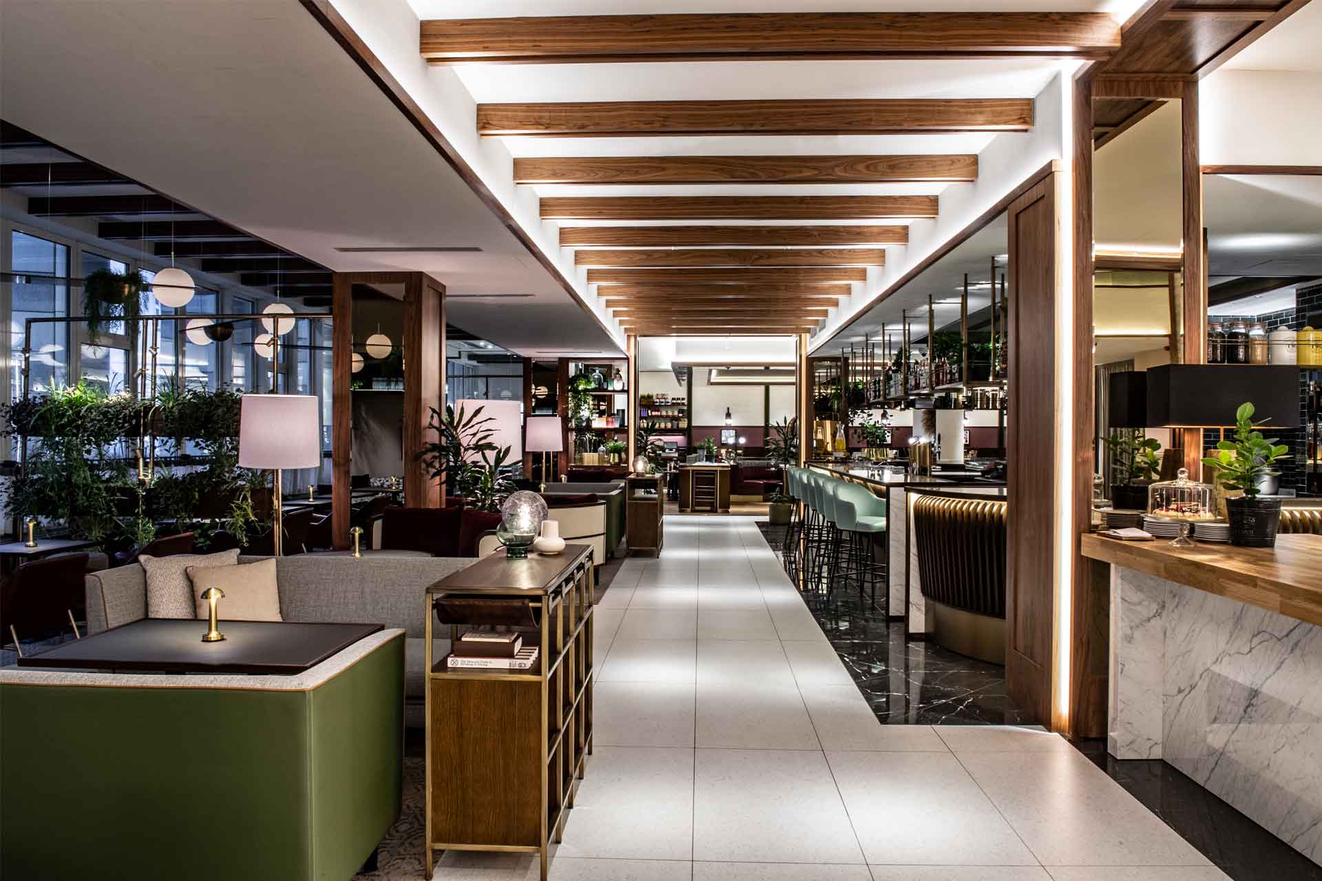
JL: We just finished Sheraton Warsaw Grand, which is a well-known property in the city and has basically been transformed. We’ve given the space a completely different zoning plan, so whilst it’s mainly a conference hotel there are lots of different spaces.
MG: One of the big issues was the restaurant – it had to be huge to handle to breakfast requirements, but was basically empty the rest of the time because nobody wanted to go and eat in a big conference hotel. It was also right on the ground floor – on the frontage to the street – so this wasn’t a good look. We took a mezzanine space linking to the function area that wasn’t being used and turned that into the breakfast function restaurant with the buffet and pantry. The trouble with conference hotels is that one night you’ll have a Champions League match and a lot of fans will pass through, so you’ll be eating with lots of shouting and it ends up being a bad experience. By giving it new zoning we’ve done a lot to fix this for everyone – they can use that breakfast function room for sports events, and this freed up space on the ground floor to put in a bar, a restaurant and speciality restaurant. They serve customers in the hotel, but very much puts all that space on the ground floor and mezzanine up for external use. This also now fronts onto the square in the middle of Warsaw, which has been turned into high-end retail and F&B, so the hotel now interacts with that as well. There’s also now an Italian restaurant that turns into a bar lounge and an Asian restaurant tucked away – it’s right next to the city’s parliament building and a lot of government offices, and the property has traditionally held a lot of political meetings, so they’ve been designed with private areas and smaller hidden spaces.
